20210327: Mt. St. Helens

I was 4 years old when Mt. St. Helens blew. My parents and I were camping in the Blue Mountains in Oregon, about 200 miles away as the crow flies, and ash from the eruption settled down on our camp. We listened to the news on the portable radio as the reports came in.

Today’s the 41st anniversary of that eruption, and I don’t know why I was thinking of it, but this painting came out of that.

20210327.jpg

20210227: State of Affairs

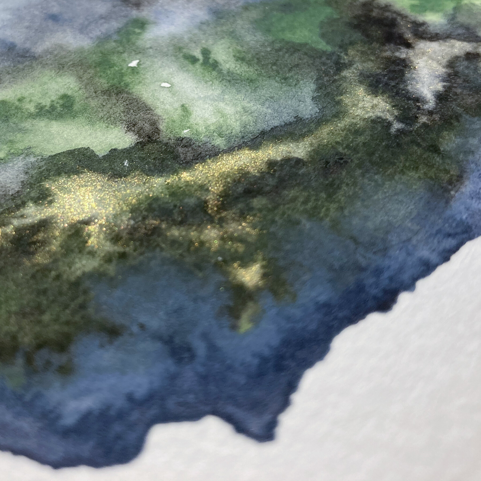
As we neared the end of the Paint Yourself Happy challenge, I got to thinking about all of the color palettes I’d been exposed to just by looking at other people’s work. There was one in particular that I was really drawn to - it was three colors: a color called “cardamom” - sort of a warm, earthy green, like a fresh cardamom pod; one called “ardoise bretonne” - kind of a neutral/cool, medium value grey; and a kind of warm black called “deep black.”

I didn’t have any of those. So I decided to use what I thought would be decent approximations: Holbein’s “terre vert,” Holbein’s “Payne’s grey” + M. Graham’s “permanent Chinese white,” and Holbein’s “ivory black.”

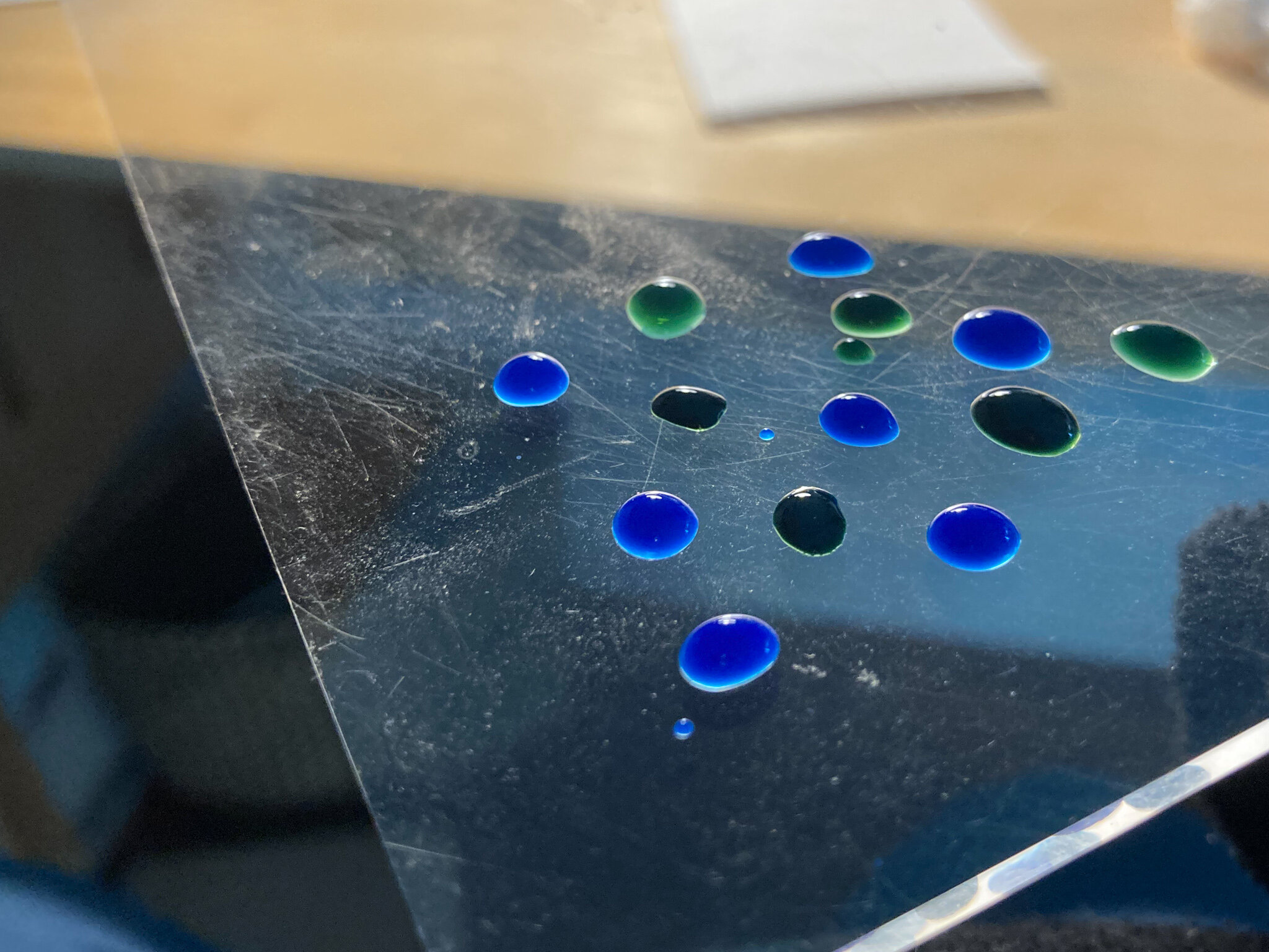
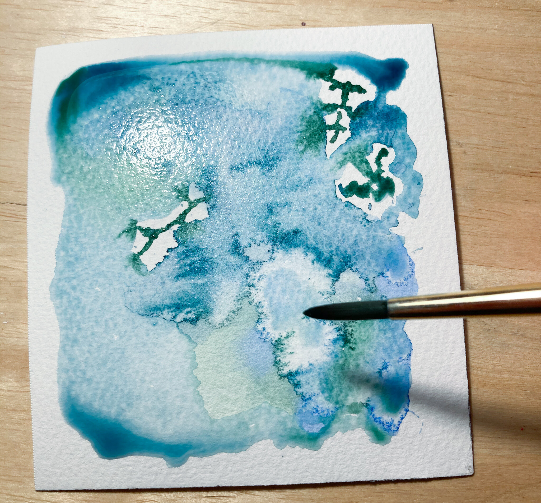
It didn’t in any way resemble the other painter’s palette. And that’s okay! I like this one, too. I just started swiping color on to see what would happen. In the middle, I felt like the thing needed some gold, so I dropped in some Holbein’s “gold.” Gold never photographs particularly well; you have to be with the piece in person to really see it.

This feels like an…honest painting to me. Is it a heart? Is it a piece of land? Yes. Yes? Yes. This is where we are. This is the state of affairs.

IMG_5242_jpg.jpg
IMG_5244.jpg

20210213: Amethyst and Grey Shape Study

13/28 of Paint Yourself Happy. Got a late start and then got called away in the middle, twice, but I finally finished it! Amethyst Genuine and Payne’s grey are two of my favorite paints to work with, but I’ve never used them together. I decided to see how they interacted. My favorite part of the piece is the middle shot of detail, which is the first time I’ve ever gone back and re-worked a part to make it closer to what I’d envisioned. In this case, I learned to add “highlight” by going back and scrubbing out some of the paint that had settled too darkly. This piece isn’t perfect, but I learned a ton doing it, and I find it soothing to both work on and look at after the fact.

Paints:

  • Daniel Smith Amethyst Genuine
    Holbein Payne’s grey

20210213-01.jpg
20210213-02.jpg
20210213-03.jpg

20210212: Magenta and Yellow Shape Study

12/28 of the Paint Yourself Happy challenge: I took some of the patterns from my last piece and experimented with applying them to a bichromatic palette. I like this for completely different reasons!
🍋
This was my first time using another new paint, quinophthalone yellow. It’s quite thick. Doesn’t like to spread much, or share the paper. It makes for a bold bottom layer and I am here for it.

Daniel Smith watercolors:

  • quinacridone magenta

  • quinophthalone yellow

20210212b-01.jpg
20210212b-02.jpg
20210212b-03.jpg

20210212: Magenta Shape Study

Doing some PYH homework. I’m pretty happy with how this turned out. I started with the squares, and can definitely tell where I loosened my grip and made myself breathe. Think it was somewhere early into the triangles. This is one of my two newest colors, and I am in love after having seen somebody else use it in this challenge. I simply had to have it. Gonna try one of these with another color and see where that takes me.

Paint: Daniel Smith quinacridone magenta

20210212a-01.jpg

20210211: The Island

After having gotten back home to my regular setup, I decided to take another swing at the variation on “Tiny Landscapes” mono printing exercise. Having a clear, rigid, acrylic sheet to work with worked a lot better for me than using the back side of a cottage cheese container lid that I’d been improvising with while at my folks’ house.

This one reminds me of an aerial view of an island, with snowy peaks and snow runoff into the sea.

IMG_5024.jpg

20210210: Green Triangles and Circles

I mixed some indigo into hooker’s green to get kind of a fir green color. The triangles started out pretty horribly, so I just decided to add more 😂. Initially I’d planned on having them all be discrete layers, but I got hasty and the smaller ones started to bleed into others, so I just went with it. I decided to spice up the circles by using a small flat brush to add spatter, which if you think about it is pretty much just tiny circles. This exercise was really fun!

Paint:

  • Daniel Smith Hooker’s Green

  • Da Vinci Indigo

IMG_5013.jpg
IMG_5014-2.jpg
IMG_5016.jpg