20210210: Green Triangles and Circles

I mixed some indigo into hooker’s green to get kind of a fir green color. The triangles started out pretty horribly, so I just decided to add more 😂. Initially I’d planned on having them all be discrete layers, but I got hasty and the smaller ones started to bleed into others, so I just went with it. I decided to spice up the circles by using a small flat brush to add spatter, which if you think about it is pretty much just tiny circles. This exercise was really fun!

Paint:

  • Daniel Smith Hooker’s Green

  • Da Vinci Indigo

IMG_5013.jpg
IMG_5014-2.jpg
IMG_5016.jpg

20210209: Bad Pineapple

My brain started rebelling against all of the repeating pattern assignments and so I just threw this down. I love looking at it.

Violet:

  • Daniel Smith ultramarine blue

  • M. Graham alizarin crimson

  • M. Graham ultramarine violet

Yellow:

  • Daniel Smith hansa yellow light

IMG_4997-2.jpg

20210209: Indigo Squares

The Paint Yourself Happy team gave us the assignment of choosing a pattern or shape and repeating it over and over again. I’m really glad I finished it, just so that I didn’t have to do it anymore. I never want to see another square again.

IMG_4995-2.jpg

20210206: Purple and gold fields

There are so many (accidental) tiny landscapes in these color fields! I believe this is my new favorite thing to paint. Day 6 of the Paint Yourself Happy challenge continues.

Tried to pick “opposite”-ish colors to see if I could get them to make some unsavory blends. That didn’t work, I love them all.
.
I love how I mixed the red and blue together to make a deeper violet but they still managed to separate in my mixing saucer and give me a surprising array of colors from indigo to aubergine.

Paints:

  • Violet: Daniel Smith ultramarine blue, M Graham alizarin crimson, M Graham ultramarine violet

  • Umber: M Graham burnt umber, Daniel Smith iridescent gold

20210206-01.jpg
20210206-03.jpg
20210206-02.jpg

20210204: Quiet Countries

Day 4 of Paint Yourself Happy. This was an interesting experiment: mono printing

  1. take a nonporous surface and put some beads of watercolor on it

  2. invert the surface and press it down onto paper

  3. pick it up and see what sticks, and work with it

I tried this challenge when I was visiting my folks, and had limited access to resources. Ended up cutting the rim off of a cottage cheese container lid and using that, with questionable results. Overall, my experiments were a bust, but this one came out okay. I think I’ll try it again later when I get back to my home office and have more of my tools at hand.

Paints:

  • M Graham ultramarine violet deep

  • M Graham alizarin crimson

  • Daniel Smith ultramarine blue

  • Holbein bamboo green

  • M Graham phthalo blue

  • the tiniest smidge of Holbein’s silver, left over from the rinse water

20210204-01.jpg
20210204-02.jpg

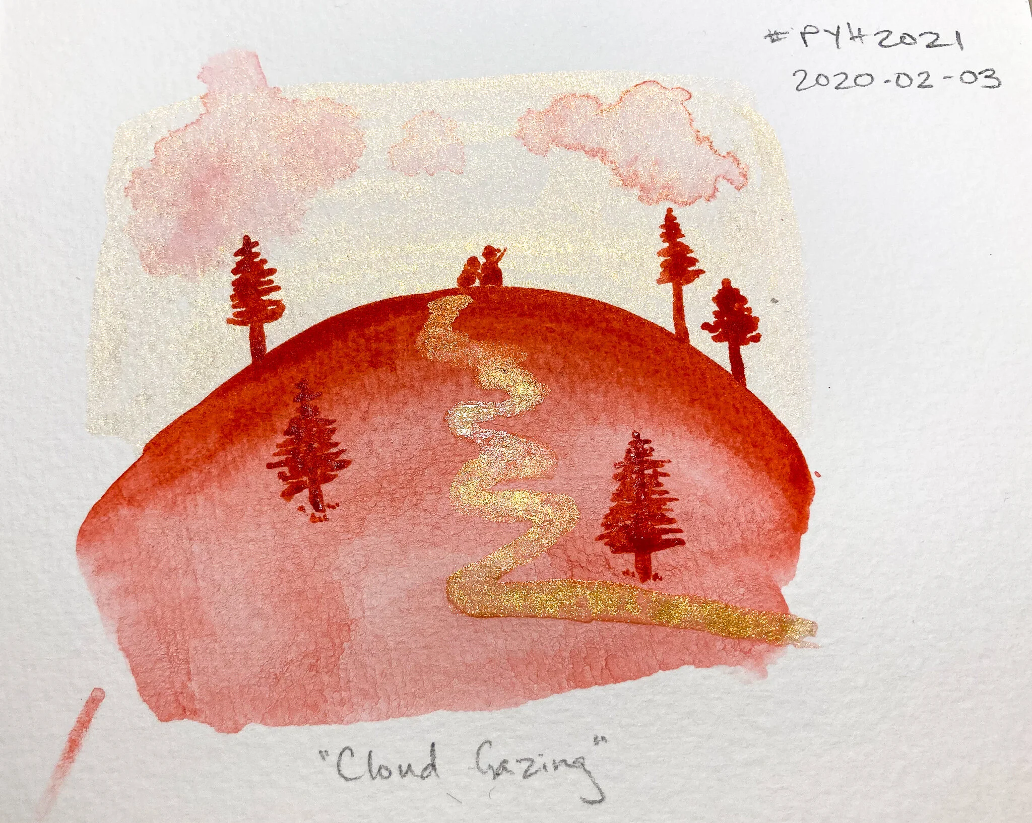
20210203: Cloud Gazing

As part of the Paint Yourself Happy assignment of creating tiny landscapes, I grabbed two random colors from the box:

  • M Graham quinacridone red

  • Daniel Smith iridescent gold

I had no idea what to do with them. I don’t particularly like painting landscapes at this point. And red and gold don’t exactly lend themselves to traditional landscapes. So I just painted a swipe of color on, and then another, and then just…kept going. It wasn’t until I was about 70% done with it that I knew what it was going to be.

This was a lot of fun. Might do it again sometime.

20210203-01.jpg

20210202: The Pond

Day 2 of the PYH2021 challenge on Insta. This whole week, we were focused on “tiny landscapes,” with the prompt being “just put down some paint and see where it takes you.”

This one was interesting for me to work on because it was the first time I’d ever sat with a piece, looked at it, and then added a layer because it felt like it was missing something. Can you imagine what the foreground would look like without the front tip of a boat protruding into it?

20210202-01.jpg

It’s also the first time I deliberately added a “bloom” (or “cauliflower,” as some call them) to add texture. AND it’s the first time I turned a mistake into a purposeful thing.

The tree below started out as a major bleed of a rather wet puddle of red into the “sky.” I let it dry down 90% of the way and then went back with a water-only brush and started dabbing in foliage. That was a delightful moment when I “saved” the painting. I felt like Bob Ross. No mistakes, only happy accidents.

20210202-02.jpg